Ideochrom is a free web tool I built for generating publication-ready chromosome karyotype ideograms. Genomics researchers use it to visualize copy-number events, gene locations, and structural rearrangements on human (and other) chromosomes — without installing anything.
The science backend was solid. The UI was not.
What v1.6 looked like
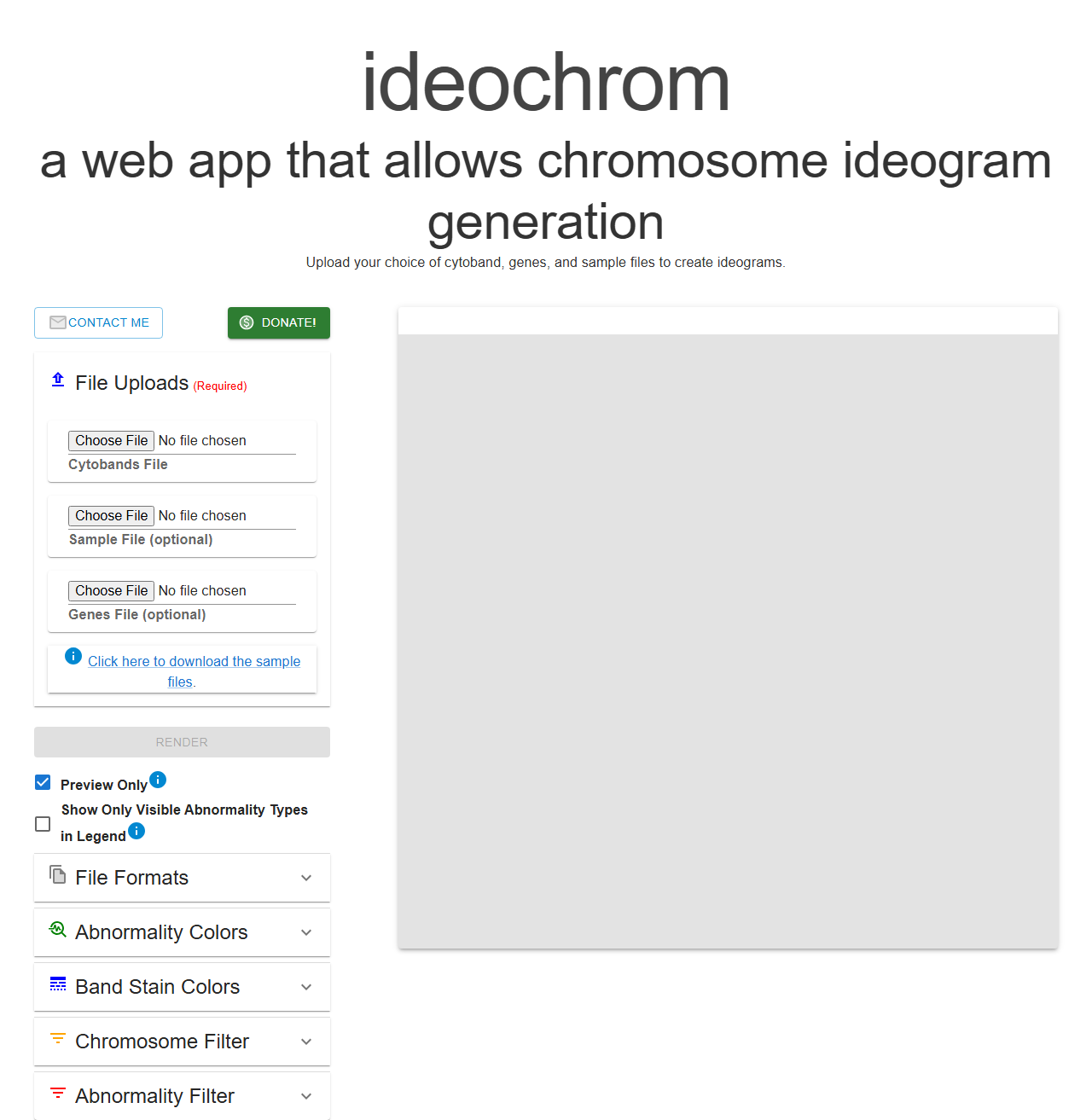
Version 1.6 was a developer’s first pass. Giant serif header filling half the screen. Browser-default <input type="file"> elements. A blank gray rectangle where the preview would eventually appear. It worked, but it communicated “unfinished side project” more than “tool you’d trust with research figures.”
I knew what needed to change — drag-and-drop uploads, a proper empty state, better layout hierarchy — but the React component tree had grown organically across a lot of files and I didn’t want to spend a weekend untangling CSS.
Bringing in Claude Code
I opened Claude Code and described what I wanted: a polished app-style layout, drag-and-drop file zones, a step-by-step empty state, and a compact header that didn’t dominate the screen.
What happened next wasn’t what I expected from an AI coding tool.
It didn’t just generate CSS and hand it back. It read the component structure — SidePanelLeft, BandsFileUpload, ImagePreview, TopInfo — understood what each piece was doing, and made changes that were consistent across the whole tree, not just isolated patches. When it touched the file upload components it also updated the parent panel layout and the empty state in the preview area to match. The changes fit together.
The things that would have taken me the most time — figuring out which CSS variables affected which components, tracing how the sidebar accordion sections interacted with the main preview — it handled without needing me to explain the wiring.
What actually changed
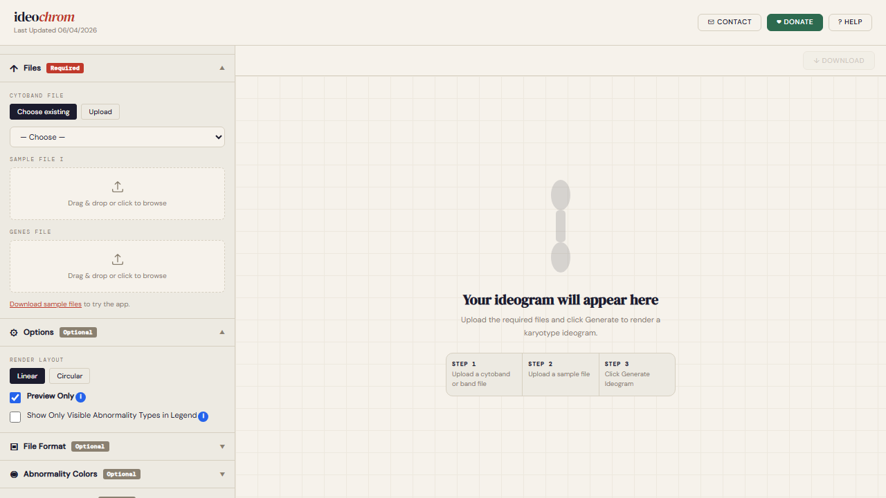
- Header: replaced the giant title with a compact branded bar (
ideochromin a smaller serif,Last Updatedtimestamp, Contact/Donate/Help buttons top-right) - File uploads: replaced
<input type="file">with styled drag-and-drop zones, separate tabs for “Choose existing” and “Upload” on the cytoband selector - Empty state: instead of a blank gray box, the preview area shows a faint chromosome illustration and a three-step guide
- Layout toggles: Linear / Circular now rendered as proper button group instead of a dropdown
- Accordion sections: Files, Options, File Format, Abnormality Colors — all collapsible with clear Required/Optional badges
- Overall feel: warm off-white background, tighter spacing, everything felt intentional
What surprised me
The speed was expected. What I didn’t expect was the coherence. Normally when I work on UI incrementally — fix the header, then the sidebar, then the preview — things drift. Colors are slightly off, spacing isn’t quite consistent, the components feel like they were written at different times (because they were).
Claude Code kept a consistent visual language across every change. I didn’t have to go back and fix anything for consistency.
The other thing: it left comments only where genuinely needed. The output looked like code I would have written if I’d planned it better up front.
The result
The before and after are pretty stark. The tool is still free at ideochrom.com — no account, no install. If you work in genomics or know someone building karyotype figures, it might save them a few hours.